Cool != Good and the future of UI

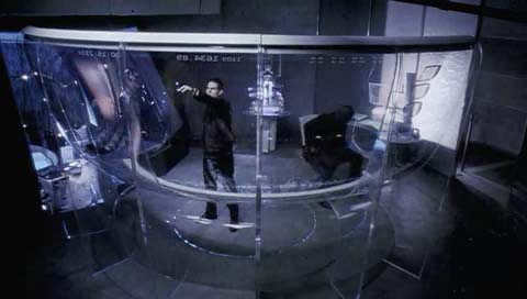
One of the sensory highlights of E-tech ’06 was the demo of the multitouch interaction project from NYU. I’ve seen projects like this before, as things like it have been tried in the past, but this is the most polished and advanced of its kind. As you can tell from the picture, this display allows for complex interactions with your hands. You can grab things, slide them around, change input modes, you name it. You can use it as a keyboard, finger painting system or image modification suite.
The problem is that the demo is so non-representative of how we use computers. It’s more like an orgy of interaction pornography (everything is bigger, faster and shinier than life) than a sampling of how the world might be better with the use of a tool like this. The dude running the demo operates at high speed and with a magicians sense of flourish and polish – they knew exactly how to make this look cool. As a research project this is great – perhaps this is, or will lead to, how we’ll interact with machines in the future. But I see all sorts of easy questions about performance and interaction that this prototype itself can’t ask (What kinds of tasks is this good for? What new and useful behavior does it enable? What does it suck at? How hard is it to learn? etc.)
And that’s the trap – it’s a classic example of Cool vs Good – It’s great that people are excited by this project, as it fun and exciting to watch (aka cool). But there are few uses for something like this that match the coolness with value – exactly the same criticism I had of the famed VR type UI in Minority report. They both look fun, and match our faith in a cooler future, but that’s part of my point. I don’t think there is a strong historical correlation between what’s cool and what turns out to be good.
The video is a must watch: Go here to read about the project and watch the short film (12MB mpeg). Kudos to Jeff Han and everyone else that worked on this – nice job.