Note: This is an excerpt from the book Beautiful Teams (3/09), a collection of essays on teamwork. I’ve been criticized for glorifying a bad experience, but my intention was to make a point about what experience is. The reason why experienced teams have value is more for what has gone wrong in the past, than for what has gone right, or at least for both. When things go right, everything is easy and no one is tested (note added: 2/23/12).
———————-
The Bad News Bears. The Ramones. Rocky Balboa. The Dirty Dozen. Real heroes are ugly. They are misfits. Their clothes are wrong, their form is bad, and they don’t even know all the rules. They get laughed at and are told to their faces that, dear God, for all that is holy they should quit, but they refuse to listen. In spite of their failings, they find ways to achieve, betting everything on passion, persistence, and imagination. For these reasons, when things get tough, it’s the ugly teams that win.
People from ugly teams expect things to go wrong and show up anyway. They conquer self-doubt, make friendships under fire, and find magic in ideas that others abandon. Ugly teams are bulletproof, die-hard work machines, and once the members of an ugly team have earned each other’s trust, they will outperform the rest of any organization. Nietzsche would have been right at home on an ugly team: what does not kill the ugly team makes the ugly team stronger.
Ugly Talent
Many so-called beautiful teams were never described in those words by the people on them. Lou Gehrig and Babe Ruth, members of perhaps the greatest sports team in history, the 1927 Yankees, despised each other. America’s founding fathers, Thomas Jefferson and John Adams, feuded regularly, in public and in private. Many great music bands, such as The Supremes, The Doors, The Clash, The Beatles, and even Guns N’ Roses, lasted only a few years before they tore each other apart.[1]
We love the simple idea that only a beautiful person, or a beautiful team, can make something beautiful. As if Picasso wasn’t a misogynistic sociopath, van Gogh wasn’t manic-depressive, or Jackson Pollock (and dozens of other well-known creatives and legendary athletes) didn’t abuse alcohol or other drugs. Beauty is overrated, as many of their works weren’t considered beautiful until long after they were made, or their creators were dead (if the work didn’t change, what did?). Most of us suffer from a warped, artificial, and oversimplified aesthetic, where beauty is good and ugly is bad, without ever exploring the alternatives.
Michael Lewis’s 2003 bestseller, Moneyball: The Art of Winning an Unfair Game (W. W. Norton & Company), explored the biases of the Oakland A’s baseball scouts when evaluating the ability of new players. Instead of focusing solely on results, the ability of a given individual to hit baseballs, or to throw them so that others cannot hit them, professional scouts were heavily influenced by appearance. Overweight, short, or seemingly uncoordinated players were overlooked despite statistics demonstrating their talents.
Billy Beane, the Oakland A’s general manager, revolutionized how the potential of a player was measured and closed the gap between what we expect talent to look like and what it actually is. He forced people to move past their preconceived expectations and to seek out less subjective measures of talent. Ugly players, or good-looking players who played “ugly” but got results, had more value than the league thought they did. His honest look at what mattered in baseball changed the way many professional sports teams evaluate and scout for players.
Similar to what baseball scouts were like before Bean’s influence, we all have firm beliefs about people that we cannot justify. Over a lifetime, we passively develop an image of how a great athlete, a trustworthy doctor, or a brilliant programmer should dress, talk, or behave, and those images shape our opinions more than we realize. When it comes to teams, most of our memories of what a good team should look and feel like come from television shows and movies.[2] Few heroes and legends in real life were as attractive and cool as the stars who play them, and rarely did their development as individuals, or as teams, proceed in a neat little narrative easily described in 90 minutes of entertainment. Films like The Natural, Saving Private Ryan, or evenThe Matrix skip past all the messy, ugly struggles of how teams form and grow, presenting us only with tales of how successful, good-looking teams adopt a talented, and beautiful-looking, leading character.
Pop quiz: given the choice between two job candidates, one a prodigy with a perfect 4.0 GPA and the other a possibly brilliant but “selectively motivated” 2.7 GPA candidate (two As and four Cs),[3] who would you hire? All other considerations being equal, we’d all pick the “beautiful,” perfect candidate. No one gets fired for hiring the beautiful candidate. What could be better, or more beautiful, than perfect scores? If we go beneath the superficial, perfect grades often mean the perfect following of someone else’s rules. They are not good indicators of passionate, free-thinking, risk-taking minds.
More important is that a team comprising only 4.0 GPA prodigies will never get ugly. They will never take big risks, never make big mistakes, and therefore never pull one another out of a fire. Without risks, mistakes, and mutual rescue, the chemical bonds of deep personal trust cannot grow. For a team to make something beautiful there must be some ugliness along the way. The tragedy of a team of perfect people is that they will all be so desperate to maintain their sense of perfection, their 4.0 in life, that when faced with the pressure of an important project their selfish drives will tear the team apart. Beautiful people are afraid of scars: they don’t have the imagination to see how beautiful scars can be.
Ugly As Beautiful
Beautiful and ugly are tricky words to apply to groups of people. If I say the Mona Lisa or Mount McKinley is beautiful, I’m claiming it is attractive or well crafted: I’m making an aesthetic judgment of an object we can collectively observe. I can point to it, describe it, throw tomatoes at it, or even allow you to compare your judgment of the thing as seen by your eyes with how I describe what I see in mine. I do believe beauty is in the eye of the beholder, but two people with different eyes are still talking about an object that exists outside of either person. However, to claim that a team, a club, or even a nation is beautiful makes less sense. A team is defined by a set of relationships between people, and relationships don’t exist as physical things.
Judging the aesthetics of non-physical things stretches the entire idea of aesthetics. It puts beauty not in the eye, but in the mind, where we cannot collectively observe the same thing. Rupert, the team captain, will have one sense of what the team is, while Cornelius, the team mascot, will have another. And certainly, people playing on a competing team will have a third. And none of them can point to “the team” as a point of reference with the same certainty they could about the Mona Lisa or Mount McKinley.
The only use of beauty applied to teams that makes sense is the Japanese concept of wabi-sabi. Roughly, wabi-sabi means there is a special beauty found in things that have been used. That pair of shoes you love because they’ve been broken in, and have carried your feet on long walks on the beach, has a beauty no new pair of shoes could ever have. Even if those shoes were dirty, scratched, and beat up in a way that no person looking to buy a new pair for himself would ever call beautiful, they’d maintain a wabi-sabi kind of beauty to you.
Sometimes the way something wears out can be beautiful to everyone. Find the oldest building in your neighborhood, the oldest tree in the nearest park. There is a majesty that comes from how something ages that depends on the imperfections it has collected over time.[4] Anyone who prefers to buy used things in part because of how they look has an appreciation for wabi-sabi. In this sense, the ugly teams I described at the beginning of this chapter, the underdog, the misfit, represent the wabi-sabi teams. These are groups that share scars, have failed together and recovered together, and are still fighting as a team. And it’s only through those experiences that a team can develop a character that has any approximation of beauty.
My Wabi-Sabi Team: Internet Explorer 4.0
In 1995, I joined the Internet Explorer team at Microsoft. It was a small, fledgling project manned by a handful of people. It didn’t even earn a spot in Windows 95. Microsoft’s first web browser was released to the world, exclusively, as an undercard feature on the $49 add-on to Windows known as the Plus Pack.[5] But with Netscape’s rise and the industrywide hope that the rise of Netscape would signal the end of Microsoft, the team exploded in importance. The executives at Microsoft, ever paranoid and supremely skilled at chasing taillights, famously turned the company on a dime and made the Internet a central part of every strategy and tactic across the company. By version 4.0, the project team consisted of more than 100 people, enough to dominate two entire floors of Building 27 on the north side of Microsoft’s campus.
In 1997, the Internet Explorer team began its fateful voyage into version 4.0. In the history of software, few projects faced as many evils as we would in a single year.[6] A litany of reorgs, executive battles, leaked design plans, impossible goals, DOJ antitrust lawsuits, and revolving-door middle management, all while bearing the weight of responsibility to save the company from the greatest threat, at least according to the rest of the industry, it had ever seen.[7] If you threw in a few plagues and natural disasters, we’d be able to check every item off the list of the major calamities no manager ever wants to face.
But the trap that would be the team’s undoing had been set ourselves: despair and hubris. The first three releases had been successes. Internet Explorer 1.0 was a simple retrofit of the purchased Spyglass browser. Version 2.0 made steady progress and was out the door in a few months. Then 3.0, the first major release, showed the world that Microsoft was not dead, had caught up, had added some new ideas, and was a contender in the game. And with a stockpile of resources in place on both sides, the fourth wave of the browser wars began. Both sides bet as big as they could, failing to recognize that the nature of the project had fundamentally changed. Like a cocky kid juggler who suddenly realizes he has more balls in the air than he can even see, much less catch, our team fell apart.
The center of our despair was called Channels. In 1997, the world was convinced that the future of the Web was in “push technology,” the ability for websites to push content out to customers (a predecessor to the RSS feeds used by blogs today). Instead of people searching the Web, the content would be smart and find its way to people, downloading automatically and appearing in their bookmark list, on their desktops, in their email, or in desktop widgets and dashboards yet to be invented. We called this feature Channels, and it was led by a small team. While they scrambled to design how it would work, the business folks raced their counterparts at Netscape to court major websites like Disney and ESPN. We needed their content to make the whole thing work: having the pipes is one thing, but it’s another to have something to push through them.
In the frenzy to make deals and catch up with the hype, we lost ourselves. Innovation cannot be achieved with one hand on a rulebook and the other over a fire. The deals we made forced legal contracts into the hands of the development team: the use of data from these websites had many restrictions and we had to follow them, despite the fact that few doing the design work had seen them before they were signed. Like the day the Titanic set sail with thousands of defective rivets, our fate was sealed well before the screaming began. Despite months of work, the Channels team failed to deliver. The demos were embarrassing. The answers to basic questions were worse. Soon, word of the Channels project’s downward spiral spread across the team and the company, taking the reputation of the entire project with it. If this was the bet all of Microsoft was making, we’d already lost.
The Internet Explorer team was never a place in shortage of opinions–loud, passionate, sarcastic, and occasionally abusive opinions. Disagreements among executives grew into denial and inaction, causing the opinionated to yell louder and with more venom. No one could survive the cauldron we’d brewed for ourselves, and eventually the project manager for Channels was crushed and burnt out. Soon he was replaced, as was his manager. Then they were both replaced. In the churn, without a taskmaster to keep them at bay, the twisty tentacles of Channels spread across the project, infecting code, design, and morale. If enough big things go wrong, everyone becomes incompetent. Everyone gets ugly. People quit. Despair rose. Managers stormed out of meetings and heavy things were thrown across boardrooms. Months flew by and therapy bills rose. As other parts of the project were completed, we tried not to notice the gaping Channels-shaped black hole at our center, slowly pulling everything inside.
I don’t know how it started, but somewhere in our fourth reorg, under our third general manager and with our fifth project manager for Channels, the gallows humor began. It is here that the seeds of team wabi-sabi are sown. Pushed so far beyond what any of us expected, our sense of humor shifted into black-death Beckett mode. It began when we were facing yet another ridiculous, idiotic, self-destructive decision where all options were comically bad. “Feel the love,” someone would say. It was some kind of bad self-help jargon, but it was so far from our reality that it worked. Sometimes we’d add a smiley face after it in an email when making a request we knew was absurd. Or we’d mockingly pat each other on the back as we said it, reinforcing how phony and clichéd the sentiment was.
It worked, because we knew we were all in the same misery, and that on that particular day, more of it had landed on one person than another. On the day I saw months of people’s work, including my own, being cut at random, just one slash on a list in a half-day-long marathon of slashes, without any logic or chance for defense, someone would say in an email, “Feel the love! It’s IE4!” Toward the end, I once saw it scribbled on a whiteboard, waiting for us at a meeting of team leaders. Even our group manager had to laugh when he saw it, connecting with us in our sardonic lifeline of morale. That moment changed something for me and for the team: he felt the same way. If we couldn’t escape our fates, at least we weren’t insane for acknowledging them for what they were.
Late in the project, I became the sixth, and last, program manager for Channels. My job was to get something out quickly for the final beta release, and do what damage control I could before it went out the door in the final release. When we pulled it off and found a mostly positive response from the world, we had the craziest ship party I’d ever seen. It wasn’t the champagne, or the venue, or even how many people showed up. It was how little of the many tables of food was eaten: in just a few minutes, most of it had been lovingly thrown at teammates and managers. I received the largest glob of guacamole ever absorbed by a human head, and somewhere someone has a photo to prove it.
The true wabi-sabi bonds grew in the aftermath. The few who remained to work on Internet Explorer 5.0 had a special bond. We had seen each other at our worst, and still felt respect. We all knew the true horrors of what could happen, and could trust each other not to let it happen again. In one of our earliest planning meetings, the entire conversation revolved around how to kill Channels and eliminate it from the face of the project. In the months that followed, my powers as a leader were enhanced by the fact that I could look certain programmers in the eye and trust them completely, having seen, firsthand, how well they’d dealt with tough situations, and they could do the same with me. We had the confidence, grown from our ugly, desperate, but collective struggles, to focus on real problems we knew customers had, no matter what hype and trends pundits were passionately guessing about. Internet Explorer 5.0 would be the best project team I’d ever work on, and one of the best software releases in Microsoft’s history. That might not mean much to anyone else, but it’s a beautiful thing to me.
Footnotes
[1] Until a decade passes and the revenue potential outweighs their mutual hatred. See http://www.spinner.com/2007/08/10/20-bitter-band-breakups-smashing-pumpkins/for a longer list of famous band breakups.
[2] Yes, I’m aware I mentioned the films The Bad News Bears and Rocky. Even the best points have a few exceptions.
[3] Disclosure: the author’s GPA may possibly resemble the one described here.
[4] During the recent renovation of the Parthenon in Greece, they considered restoring the building to what it would have looked like when built. But they decided instead to restore it to the ruin it is, as the aesthetic of the exposed stone and worn-out marble better fits our expectations for what the building should look like. Wabi-sabi trumped new and shiny.
[5] Even the marketing team wasn’t sure if this web browser thing was going to pan out, as more surefire features like a desktop theme manager, hard drive compressor (hey, it was 1995), and background task scheduler earned equal or better billing.
[6] I’m not proud of this fact, but I’ve yet to hear a story that tops the drama of IE4 given the stage it played out on. If you have a nomination, however, I’d love to hear it. Miserable project survivors love company.
[7] Don’t take my word for it. Two books have been written about this period of time at Microsoft. See How the Web Was Won by Paul Andrews (Broadway), which is ridiculously positive about all things Microsoft. Alternatively, Competing on Internet Time by Michael A. Cusumano and David B. Yoffie (Free Press) presents a more balanced story told from the Netscape perspective, but focuses more on strategy than the personalities or tactics.
I’ve written often about web browser design, so I happily downloaded Chrome, Google’s new web browser (download), a few hours ago. Although I’ve been running it through its paces, this is an early review, as its over days and weeks of use that some features shine, or disappoint. Disclosure: I worked on IE 1 to 5 for Microsoft in the 1990s, and currently use Firefox 3.0.1.
Summary: Chrome is a low-frills, light-weight, stable (for me) beta quality release. High points are the simple design, easy import of FF/IE bookmarks, and (promise of) greater performance. Low points are beta level completeness in UI, and few of the familiar frills from IE or Firefox. There are big bets in here that challenge existing browsers, but will take several versions to fulfill.
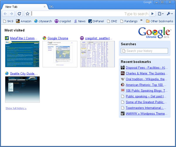
UI: The most notable move is starting with a thumbnail view of most recently visited pages. I’ve advocated for this in the past: anything a browser does to use past user behavior to accelerate future behavior is a win. Showing the choice of the ten most frequent places I go as the first place is downright basic UI design goodness. Otherwise there isn’t much UI to speak of. The the actual browser chrome is thin, making the name ironic. No menus. No home button (option to turn it back on). Dropdowns to the right of the address bar provide access to tools and options, much like IE7/Vista. Bookmarks, in a generic scrolling list, are accessed via “other bookmarks” in the lower right corner.
One clever perk is an improved find. Hitting Cntr-F extends the top right of the toolbar into an edit box, with a up/down arrow combo for moving through hits on the page.
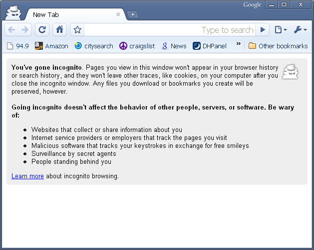
Features: The big news is Incognito mode. You can open a window with maximum privacy: no cookies, no history, no nothing. Gripe is this can’t be a tab: it forces a new window. I was intrigued by this until I realized realized previous cookies still worked. So its not an entirely anonymous browser mode – it’s anonymous from the moment you create the window forward (either that, or I experienced a bug). History search is provided through the Most frequently used home page – it’s simple and worked well, and runs full screen (unlike FF or IE).
Another big move is task monitoring by tab. You can look at each tab as a separate process and kill individual tabs. Right click on the title bar, hit task manager, and there you go. In a couple of hours I didn’t get a chance to use this, but if it works as promised whole-browser shutdowns should be uncommon.
Performance: There doesn’t seem to be an easy way to test javascript perf – no stanard test suite i could find. Across the board of 3 different (kane, WD, SunSpider) test suites i ran, Chrome won. Margins ran between 20% to 100% improvement over FF or IE7. For subjective measures I spent a good half hour on Jay Is Games, as flash games tend to push browser & system perf to its limits, but didn’t notice significant differences. This is an ad-hoc perf analysis, and focused purely on Chrome’s strength (javascript), but it was nearly all in Chrome’s favor.
Platform . Much of the promise described in the Book about Google Chrome (Charmingly cartooned by Scott McCloud, but a 2 page doc would have been an easier read) is about the platform. Improved security, enhanced performance, and an architecture that makes plugins and extensions easier. It’s hard to test or evaluate these things in an afternoon. I definitely liked their story for what they’re doing and why, but platform plays require getting FireFox and IE developers to take advantage: a long and slow process, no matter how amazing the new kid on the block is.
Bugs/Gripes:
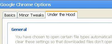
- Tools.Options. There should never be consumer facing UI with labels “Minor tweaks” and “under the hood”. Anything in Tools.Options is under the hood. Call the different groups something that helps me pick which grouping I need: Browser Preferences, Network Settings is easy split. This UI is a conceptual mess, which is fine for a beta and common for the UI ghetto that is often Tools.Options, but a proper UI designer should get in here and sanitize.
- Wrong Shortcuts. Rule #1 of being the new browser: make it easy for people from old browsers to switch. At best even early adopters will be switching back and forth between Chrome and something else for months. Most of the IE7/Firefox shortcut keys do not work in Chrome. Easy to fix, and hope to see this in the final release. It’s easy code. Why not have a FF or IE user mode that swaps in the right shortcuts (Firefox is guilty of this too)?
Chrome info and download
Something’s wrong if, after 5 and 2 years respectively, the two most popular web browsers deliver mutually low-key major releases. All the talk of how Firefox has revitalized competition in web browsers, the most used PC applications, has had little impact on this round of browser design. Everyone (Opera and others aside) is shoring up, not taking new ground.
Any review of these two browsers, efforts so similar in functionality and core design, has to be about details. There are differences, primarily in interface design, but also in fit, finish, and vibe.
IE7
Five years since the last major release, IE7 delivers on most of the innovations Firefox popularized: Browser tabs & RSS feed support the most notable. Kudos to the IE7 team for picking up the design baton and making some visible changes, and for those who criticize them, you have to catch up before you can get ahead.

But within moments of taking IE7 out for its trial run, there are noticeable visual mis-steps: the shiny polish of the grayed out back/forward buttons. The weird background gradient behind the tabs. The empty tab all the way to the right (its the new tab creator, but it looks more like a birth defect, given it has no icon, text or anything).
These are the kinds of details only UI designers would call out – but they add up in the minds of users. Its the details that create feel and vibe, and that’s where IE7 leaves me cold. I know many people worked hard to ship this thing, but their love and passion was hard to feel when using what they made. I live in a web browser all day, and like my living room, the details matter. My guess is the visual designers were tasked with being midway between Vista and XP (explaining the elimination of the command menus), a difficult middle ground to hold.
However, in the days I’ve used IE7 as my primary browser I found its workman like charms. It does what it needs to do – stays out of your way, and seems to have filled in, lack of polishes aside, the major functional gaps between IE6 and Firefox.
Innovators note: the quick tabs feature is interesting but mostly a lark. Thumbnails of web pages, as much as i tried, never seemed to help me do anything except demo IE7. The Zoom feature was nice, given my aging eyes, and improved phishing detection (which was hard to demo) and other security improvements seem to be a large part of their marketing message, but I had few comments on these anti-features.
Firefox 2.0
I did a short, underwhelmed review on their beta2, and the final release held few surprises. This is entirely a polish and plumbing release. They invested in infrastructure (installer, JavaScript 1.7, etc.) and some minor UI enhancements. The addition of spell-checking (a la MS Office red squiggles) seems minor, but is easily the underdog champion for best low hanging fruit feature in this wave of browser updates (Despite its clear value I have to lament: it’s 2006, the age of the blog, and all browsers don’t spell & grammar checking? Yikes).

While Firefox’s toolbar design is more conventional, it’s also more polished. The side gradient shading in the icons (look closely at the Reload and Back buttons) give it a warm, friendly feel. Notice how their tabs are easy to scan, uncluttered by text on blue gradients. They shifted all non-active tabs to black on gray, a simple way to make large tab sets less oppressive (though scanning non-active tabs is slightly harder now).
The summary
I’m still a dedicated Firefox user. While 2.0 is a conservative release, the product does a better job delivering on core ease of use and functionality: its an easy recommendation. Despite being a browser designer, I have mostly simple browser needs, and would recommend FF to just about anyone. If you factor in the vibrancy of their add-on community, it’s also a winning choice for power users.
IE7 is much improved – but visual design mis-steps, some awkward design choices, and lack of any compelling feature advantage makes it impossible to recommend it to anyone currently using Firefox. I’d recommend the upgrade to any IE6 user for the security improvements alone, but also for the benefits of tabs.
In general I’m left hoping hoping that both camps have their eyes on what browser user experiences could and should be like. There’s so much more user experience ground browsers need to cover. Lets hope IE8 and FF 3.0 build on their current foundations and take up the charge.
IE7 Download / FireFox Download
And don’t miss my review of Opera 9.02 – you’ll be surprised.


 It’s been months since I’ve commented on

