Last week I was on an expert panel, giving feedback to final project presentations at the HCDE 518 User Centered Design course at the University of Washington, taught by Douglas Pyle (syllabus here). Its always fun to see what students are doing. They are the future after all. My fellow experts were Matt Shobe, Larry Sisson and Marcos Nunes-Ueno.
7 teams each has 12 minutes to present. Our job was to ask tough questions and critique their presentations from a professional context.
The project was: Apply user research to a major cloud service and redesign it (Dropbox, SkyDrive, iCloud)
Things I learned:
Students have fresh eyes. While many of the students in the program are not undergraduates, because the project is in the school environment their take on things is different, and there are always surprises. It’s really enjoyable to listen to student projects talk about their assumptions, ideas and designs. I was supposed to be there providing “real world” commentary, and I did, but I learned a few things and heard quite a few surprises. If ever you get the chance to do something like this in your field, I recommend it.
Group presentations are hard. There were 7 teams, with 4 or 5 people each. Everyone was required to participate, and making a single, clear, coherent presentation when you have to divide it into 5 parts for 5 people is just hard. Part of the challenge of giving feedback was separating artifacts of the presentations from the research and designs themselves.
Generative vs. Evaluative. While I’ve known there are dozens of different methods, I’d never heard them divided into two piles: one for coming up with ideas (generative) and one for evaluating ideas (guess what that pile is called). Nice.
Technology moves in spirals. Many of the teams were ambitious, adding major new functionality. Being an old dog, I can recall when the web was often sold on the promise of simplicity and single purpose designs, a huge relief from the heavy all-in-one collaboration tools of Lotus Notes and SharePoint. But the cloud is maturing and, according to these students, the need for collaboration at work will push complexity back in. Setting up of course the next wave of simple tools to poke holes in it all over again.
Cool things I saw
Team 6, Matina Fresenius, Allan Luik, Ashley Saleeba, Don Wesley and Jessie Xue, focused on the challenges of sharing files through DropBox.
They surveyed DropBox users through Social Media and Craigslist.
73% used dropbox through the web portal
Wide range of content file types
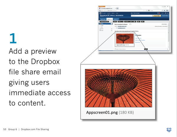
92% wanted preview before downloading shared files from others (it had been requested on dropbox forums in 2009)
They observed 11 real users and recorded the key places they struggled.
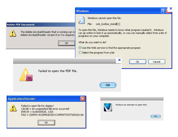
The result was a design that changed this:
To something like this (which Dropbox actually implemented before their file presentation):
Group 3 took on iCloud. They were one of the most ambitious redesigns, and had the bad luck of going last. Their good luck was picking iCloud, which no one else had taken. They were Sarah Emerson, Andrea LarsenBronwyn McNutt and Zulka Ramirez.
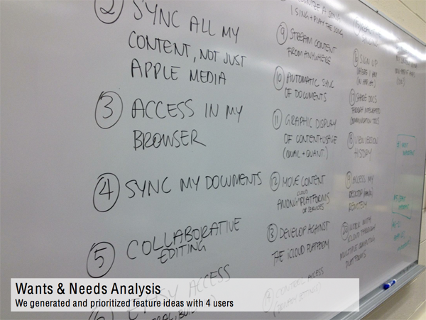
Among the research they did was a Wants & Needs analysis, where they work with users to prioritize possible improvements to the existing design.
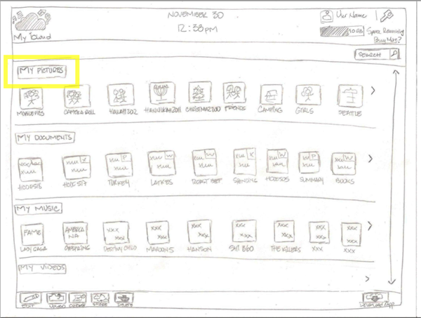
Then they built a paper prototype (I so wish more people used this awesome and fast method), using a “Netflix style” view of all of your content.
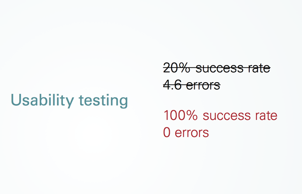
Group 7 (Brian Espinosa, Royal Stuart, Lori Tompkins, Adrienne Trudeau, Dasha Valchonak) was one of the few teams that reported on before and after results for their redesign. In a briefing, it’s data like this that tells most of the story.
People throw around sayings like “Easy to Use” or “Intuitive” but without some data those are merely opinions. When it comes to measuring ease of use, there are well established things to track:
Success rate: What percent of users can even do the thing its supposed to let them do. Often this is well below 100%.
Time on task: how long does it take users to do the thing it supposed to do. Better designs take users less time.
Error rates: how many mistakes or confusions does the user have.
Team 7 did quite well in their redesign. However I’d have preferred they call it a usability study, not a test. A test assumes there are right answers and that you do it at the end. A study suggests is more about collecting data to make better decisions. Yes, it’s a pet peeve.
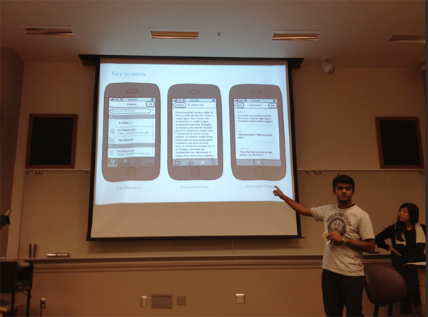
While many of the redesigns were ambitious (as Shobe said “making a bit tent”), one of my favorites focused sharply on one scenario: how to improve collaboration as simply as possible. This team was comprised of Ajay Alfred, Sue Boivin, Jeanie DuMont, Alicia Lee, & Pat Matrich. Based on research, they decided the most valuable feature to add to Dropbox was the ability to add comments to Dropbox files. This would allow someone updating a document to leave a short note about what the change was, or ask/answer a question without having to open the document. And they focused on the mobile design for the feature first, with a design that seemed simple and slick.
Sloppy claims in User Research
I’m always cranky about how anyone in any field uses ‘research’ to justify things. Of course these were students and they were being graded primarily on their redesigns and presentations, not the details of their research. However I kept track of sayings and statements that had this been a professional situation, I would might have challenged.
Many people in the professional world BS their way through talking about research – particularly with the bias of “the research magically says the thing I wanted it to say before I started doing the research”. Everyone is guilty here. But if you call yourself a reseracher its fair to expect more in the way of research ethics. Its not hard not to be sloppy. Sloppy sayings include things like:
“Our research said…” – research never ‘says’ anything
“Our study indicated people want X” (Couldn’t an evil person design a study to get people to say they want X or Y or Z?)
“We had compelling evidence…” What does compelling mean?
“Our findings proved…” – What does proof mean? Could it have been used to prove other conclusions?
“It was obvious…”
“The redesign had great success…” – by what standard? What metrics were used?
“Many..” – Is that 1 or 2, 3 of 5, 5 of 20?
“We found that users…” How many of them? All? 4 of 7? 2 of 7?
“Intuitive…” – should be a banned word. Better off talking about tasks and usability measures.
“Most cited…” – maybe only one thing was cited.
Naming a percentage without mention of quantity (e.g. 100% of 1 user doesn’t mean much)
“Users want… ” – this is always speculative data, as what users want and need are often different
Anecdotal vs. Substantive data (e.g. “What we heard in the usability study” – is that one person? More? What?)
“They wanted…”
Sloppy use of phrases like these sets off alarm bells for my BS detector. Even if there is nothing sketchy going on, its the researchers job to ensure there is no room for doubt. All researchers should assume they have to earn the trust of their audience. As a result, I have a list of questions I often ask people who claim their design decision is right based on research:
How many participants were there? Was that enough to have high confidence in the data?
How did you compensate for recruitment bias? (all participant recruiting has bias)
Do you have specific criteria for ‘success’? If not, how do you know it was better?
How do you know your questions and methods didn’t lead participants to the answers you wanted? (Did you counter-balance, etc.)
What questions can not be answered by your research?
It was unfair to poke hard at this in a student presentation – and I tried to clarify the point and not beat them up much about it. But here on the blog I can ramble on and on about it, assuming anyone is still reading.
The best recommendation was to have a couple of slides hidden at the end of the slide deck with detailed summaries of the research (# of participants, methods used, specific data on results, etc.) in reserve, to pull up if you have a hard-ass like me in the audience, which the more UX work you do, will happen sooner or later.
Thanks to Doug Pyle for inviting me, and all the students for letting me hear their presentations.
Last week I spoke at the Puget Sound SIGCHI meeting. Since it’s a group of designers and user researchers, I let them participate in picking the topic, and top mistakes won by a wide-margin. I didn’t use any slides – instead I led an interactive talk, summarized below. Rather than talk about tactical mistakes, such as prototyping or running studies, I focused on the ones we overlook the most, about attitude and culture.
Not credible in the culture. Most designers and researchers are specialists, making them minorities in the places they work. Most training UX people get assumes they are working alone, which is rarely true. This means their values and attitudes likely don’t match the work culture of most companies. The burden to fit in, or to recognize what the culture value’s and provide it, is on the specialist. If you are the best designer alive, but work in a place ignorant of design, your lack of credibility in the culture renders your design ability useless. Being a specialist means you will always be explaining what you do, your entire career, including translating your value into a language your coworkers can understand.
Never make it easy. The first users you have are your co-workers. How easy is it to follow your advice? As a specialist, its easy to become the UX police, scolding and scowling your way through meetings. No one likes the police. Generally, people do what is easiest to do. If your work creates more work for them, they will naturally want to avoid you. Specialists often scowl from ivory towers, where they provide advice that is hard to follow, or sometimes, hard to understand as it’s not in the language of the culture.
Forget your coworkers are meta-users. Unless you write production code, you are not actually building the product customers use. You make things, specs, mockups, or reports, that are given to others who must convert your work into the actual product. This means you must design both for you actual customers, and for your coworkers, who are the first consumers of your ideas. Usability reports are often tragically hard to use. Mockups and design specs often forget details developers need such as sizes in pixels, and hex colors.
Never get dirty. In many tech cultures there is plenty of dirty work to do: mainly finding bugs and reporting bugs. Anyone can do it, but no one wants to do it, and everyone avoids it. Often there are bug bashes or engineering team events to find and deal with bugs. As a specialist, its easy to go home early while the development team stays late to do the dirty work. If you’re part of the culture, you’d stay and help when there is dirty work to be done. But if you’re a consultant, you’d go home. How do you want to be perceived? For people who don’t know what you do, helping out with the dirty work may be the first way to earn a positive reputation, or to make that first friend or two.
Pretending you have power. Most specialists play advisory roles. They give advice. There is nothing wrong with being an advice giver. The challenge in being an advice giver means the critical skill for success is persuasion and sales. You need to be an expert at selling your ideas. To pretend that you don’t need to sell your ideas, is to pretend you have power. Advice givers should be evaluated heavily on how much of their advice is followed. Giving advice is easy. Getting people to follow it is where your value is.
Ignore possible allies. Among your co-workers, one of them loves you the most (or hates you the least). If you are not enlisting them to support your requests, or give you feedback you’re ignoring your possible allies.
Vulcan pretension. There are deeply embedded value systems among designers and researchers that are self destructive. For research, its Vulcan: “I research, analyze, and produce data. I do not offer my own opinion ever.” But everyone else does give opinions, and in many cases the opinion of a researcher is more valuable. Researchers should say feel comfortable saying “This is not based on data, but I think…” which protects the integrity of data, but allows them to offer opinions just as everyone else does.
Dionysian pretension. For designers, its the dreamer mentality as an excuse for not having to do the thinking required to make an idea real. “I just come up with ideas for things, its not my job to figure out how to make it work.” This is related to never getting your hands dirty, as all ideas have dirty work required to make them real that must be done, and if the person coming up with an idea does not participate in the process, it demotivates everyone else from wanting to follow that idea.
Don’t know the business. Everyone should know why they have a job. Who decided to hire a UX person instead of another developer? What argument did they make? Find out. Find out how the company makes money and which kinds of decisions are likely to make profits grow. Having a better UX doesn’t guarantee anything: many market leading products are UX disasters. How can this be? If you don’t know how that’s possible, then you don’t understand how many other factors beyond UX are involved in your business.
Advice Summary
Earn credibility in your culture on your culture’s terms.
Make it easy / fun to follow your advice.
Design for your developers/managers, as they are the first users of your work.
Ask your best ally (who is not in your job role) that question.
Don’t always change the conversation in meetings to ask the same question you always ask. You’ve become a UX robot, always saying one of the same 3 things.
Saying the same things over again and again, but not affecting change isn’t helping anyone.
Know and be aware of “what conversation are we having?” for each meeting (tip from audience)
Good Project Managers empower the people in their team. But good project managers are rare.
How do we educate our co-workers of our value?
Start on their terms. How do you solve a problem they need solved? (Ideally using your special skills, but being useful at all is a better start than being non-useful but a “design expert”)
Most people have no idea what you do. Part of your job will always be to give the intro talk about your profession.
You can’t do it en masse so divide and conquer:
Ask your co-worker, “I’d like to talk to you about what I do so I can get your feedback on what I’m doing.” The next meeting you’ll have one more person (hopefully) on board and who understands what you do.
People want data (observation from audience member)
Data gives you credibility.
Video clips give you credibility.
Anyone can go capture video of the product being used.
Pay attention to how decisions get made:
What data works? Is it numbers? Stories? Who yells the loudest?
Are you sure decisions are made in meetings, and not in private discussions?
Does the VP always make the decisions? Who do you know who has the ear of the decision maker?
Seek informal channels – Conversation at people’s desks, or over coffee.
Another Mistake: Never Make It Easy
Designers have multiple users along the way, for instance, developers who get our wireframes, with color codes, pixel sizes, or CSS they can reuse, are happy developers.
Developers are always busy juggling 9 things they need to get done.
Set it up so the devs get some reward every time they work on your design. What positive reinforcement of the behaviors you want do you provide?
Film analogy and design decisions
Film has hundreds of people working on it. But there are only a few people who have enormous power. Out of 500 people, maybe six or seven people have power over the creative direction of the film.
Amazon and Microsoft’s designs are an “averaging out” of many people’s input. (This goes back to the earlier point that design expertise is weighted less than dev expertise).
When there are smart, confident people working on things they are passionate about, there’s going to be unavoidable messiness. There is no ideal team where everything goes smoothly and every decision is contention free.
Inspire people to do things they wouldn’t otherwise do.
There’s a thin line between being inspiring and being a jerk. One person’s inspiration is another person’s annoyance. The most inspiring thing a person can do is to work hard on problems they care about that align with what the team cares about, share that work with others, gracefully take feedback, and continually produce.
Noticed a small usability issue with how Amazon.com promotes Kindle editions of print books.
This is what’s known as a bad default – it often happens when there are multiple defaults that could be considered logically correct, but only one is going to be considered correct by most users.
The scenario: while there is a separate URL For kindle editions of books, most often it seems people are sent to the print edition page, which shows the list of formats in a nice box in the middle of the page.
As you can see in the image below, the kindle edition listed is old. It’s for the first edition of the book. You’d only notice this if you hovered over the kindle edition link long enough to see the old cover and pub date, which people in a rush to purchase are unlikely to do.
To find the latest kindle edition, you have to click on the little + icon to the left, and then click on the newer edition listed below. Surprise! The best, most awesome edition of the book is hidden down below.
The solution:
Change the default. As a rule, always default to the most recent edition of the book. For anyone who wants the first edition for some reason, they can dig in to find it. For everyone else, default to the most recent.
The post isn’t much longer than the tweet. And it’s popular. Which testifies mostly to two things:
Some people are very sensitive about job titles.
People in the UX/design/etc world might win the prize for most sensitive.
If ever you want a popular blog post – post about how “UX doesn’t exist” or “interaction designers are kitten kicking liars” and you’ll be well on your way. These are passionate, if perhaps touchy, people.
For decades now people who work in various aspects of UI/UX/IA/Usability/kitchen sink/Interaction design/graphic design related work have agonized, fought, debated, resisted, modified, abbreviated, and debated again the names they use for their work and the roles. It’s an old wound and this jabs at the stitches.
An easy way to spot people with identity issues, or professions that feel marginalized and vulnerable, is how much drama they make about what they call themselves and what other groups of people call them. More telling perhaps is how much in-fighting and factionalism there is among groups with largely the same ambitions, rhetoric, and in some cases, members. They’re good at human computer interaction, but human to human interaction seems lost on them.
In the end, they’re just words. People who are busy with clients don’t worry so much about words (and they also have fewer slashes in their job description). If you provide great value to your clients, they’ll hire you no matter what you’re called. Provide little value to clients and you could call yourself God and still not get hired. Actually, calling yourself God (“I am the GOD of UX, hire me or I shall smite you”) is likely a very bad way to get a job, but that’s a story for another post.
Case in point: If someone were to say “Doctor is a bullshit job title“, few doctors would care. The fact that they think they’re doctors, and their patients pay them for doctoring, and everyone is happy with the result, proves that it’s not a bullshit title for the people actually involved.
In the case of the actual post (‘UX professional’ isn’t a real job), it does have some points. I agree that in the ideal world, there is just making: makers of things for people should know not only the technologies of making, but the skills of how to design things to be easy to use. All engineers and craftsmen and makers and managers who decide issues that effect customers should understand this stuff – but that’s in the ideal world, a place I’ve yet to find.
But there are simpler issues worth calling out:
I don’t know anyone who calls themselves a UX professional. Is that real a title on someones business card? I’ve never seen it. So on that I agree. Doesn’t t having a business, or a business card, make you a professional?
We forget (only some) people are much better than othersat everything. There are some developers who can do everything. These people don’t understand why specialists are needed – because mostly they don’t need them. Unfortunately most people in most fields are not good at everything. The average web developer, or writer, or anything, has many skill gaps, despite the fact that it is their profession. Their recognition of their limitations is good – for the client and the client’s customers.
We tend to be myopic in our experience. The client world, and the in-house world, are different things (the author does try to clarify this in the post). It’s easy to think all projects in the world are similiar to the ones you tend to do. It’s hard to imagine how a 500 person team functions if you mostly work on teams of 5. Without exposure to other kinds of work, or work for other kinds of clients, the notion of specialized roles or tasks is unimaginable, and for many people the unimaginable is lumped in with the stupid, dumb, unnecessary or wrong. A few minutes of thought reveals specialization is in all of our lives: doctors, restaurants, etc. Nothing wrong with that. Some buffets in the world have amazing food of all kinds, but more often, if you want the best at a specialized thing, you’re better off going to a specialist for it.
Everyone thinks they’re great at something they suck at.It has happened dozens of times to me where someone tells me (e.g. talking) how great they are at design, or making easy to use things, or basketball, or singing, and they when I witness them doing that thing (e.g. doing), I quickly realize they suck. Sometimes they’re just very confused, but other times they’ve simply never seen someone do better than what they do, even if what they do is damn mediocre. Reading the comments, I’m sure this is true for many on the thread. There’s a wide range of what it means to be good, or good enough, or having a clue at all. Talking about design pretends everyone has the same notion, but we don’t. The notion ‘good enough’ has, I suspect a very wide range.
I’m fond of simply calling myself a writer. There should be a verb in your job. Usability engineers are really analysts or consultants. Designers of all flavors are, surprise, designers. Information architects are planners. If they are expected to be leaders beyond their specialization, then add the word lead. And on it could go. one word, preferably a verb, and we’re done. The pretense is fancier titles better convey the role, but I think that’s the real bullshit. Simpler titles, based on a verb, would be way more useful for clients or co-workers in figuring out what you can do for them.
However the competitive realities of the professional world incents all kinds of inflation and stupidity – every industry has its share of odd, weird, redundant and misleading job titles, and the tech world is not immune. But the wise realize job titles are not the problem. Instead it’s the skills and motivations of the people involved on your project, a challenge no amount of title-wrangling will ever solve.
Nicholas Carr’s recent post on delinkification explores whether we’d be better off if we didn’t use hyperlinks in-line. He’s hitting on an old issue among the hypertext crowd, as various kinds of hypertext systems, from Apple’s Hypercard, to Hyper-G, have explored the pros and cons of the entire concept of hypertext.
In ancient times, I did some rudimentary studies on the effect of links on reading in 1995 for IE 1.0 and IE 2.0 – I recall many preceding academic studies on hypertext that went further than we did (oddly enough, they’re hard to find on the web – still looking). Some of that data will be too crusty to apply to today’s web, but some of it is entirely relevant. I’ll follow up if I can find the good stuff.
A few points worth adding to the debate:
The skill of the author is missing from the conversation. The better the writer, the better the job he/she does at anticipating questions or making sure the links are worth the cognitive cost of forcing the user to decide to click or stay. In similiar fashion we can criticize paragraphs, semi-colons, (parentheticals), fonts, bold/italics,blog templates and many factors that we know impact people’s ability to read, as when they are used poorly they do create problems for readers. All choices writers make have cognitive tradeoffs. Readability, a simple filter that makes pages easier to read, is a surprisingly good alternative to many website and blog designs, but for the better writers on the web, it takes away more than it gives.
This echoes the debates about footnotes and endnotes. I’ve done anecdotal research on this, and in reading this 30+ comment thread of people’s impressively specific preferences, I concluded there is no final answer. It’s too personal, and often people’s feedback hinges on the endnote/footnote style of the last book they read. It’s easy to forget there are many ways how footnotes are used, much like links, some better and some worse. Some uses, in some situations, earn their cognitive costs more than others.
Good browsers should apply preferences for links, including what Carr describes (holding all links until the end). Markup languages are supposed to allow the browser to choose how to present various things, including links. If the reader wants to view all the links at the end, or on the side, or automatically go and pre-load pages, they should all be part of what a browser does to create a good reading experience. This does create conflicts of artistry (should my words appear as I want?) but the spirit of HTML/CSS or any markup language is to give control to readers as well as writers.
Tabbed browsing changes the risks. For those users who use them, it gives an alternative. I know I and other tab users open links from an article in tabs as I go, and let them wait until I finish the article (or until I get stuck on a fact/reference I hope is addressed in a link).
If minimalism for reading is ideal, web site design is a factor too. Even Carr’s site has a top navigation section, and a sidebar with various links and images of books to be clicked on (not that this negates his argument – less distractions are less distracting). Images are possibly more of a drag on cognitive load than a single hyperlink, and it wouldn’t be hard to do research to find out (I suspect in a reading comprehension comparison of Readability vs. most website designs, Readability wins).
Perception of credibility. Forget the reality – in some cases links show the possibility the writer has done their homework. In a glance I can see the link density of a page – too much and I might pass, but none at all, and I might wonder if the writer has thought much about the topic, since they didn’t bother to show they’d found a reference to support or counter their own claims.
I’m a fan of the unconventional view that most people, most of the time, worry about the wrong things.
When it comes to the world of UX, designers, usability engineers, and the rest, they tend to complain about how little power they have, but spend little time doing skill development in how to gain influence and power. The average designer or IA would be better served by going to a sales conference and learning sales and pitching skills, than going to yet another design event. They’re already good at design, but they’re probably not very good at pitching design ideas to non-designers.
One fallacy in how designers and HCI experts are trained is the lack of recognition that most of their careers will be spent working with people who know almost nothing about design or HCI. They are set up to be marginalized and kept in the corner of organizations, since they’re never shown that their success hinges not just on expertise, but the ability to translate that expertise into terms the people who they work with, and for, can understand. The biggest skill gap the UX world has are advocates, translators, and persuaders, people who are not afraid to sell and convince others on the value of their work.
Last year at UI14 I met Alastair Simpson, a UX manager who, in a former life, worked in sales. I asked him to blog about how to apply his sales background to the challenges of working in UX, and finally he did.
Here’s an excerpt:
Each time I visit a conference I hear the same problems faced by UX professionals. Not the never ending search for a perfect interface, the perfect user flow, or a usability test that passes without incident. Most commonly it is “If I could only get the budget, my CEO just doesn’t listen to me in meetings, they seem to switch off and just don’t understand my point of view”. In the majority of cases this is probably your problem, not theirs. Successfully pitching your ideas and making your managers, and their managers buy into the UX problems on your site is essential in getting sign off for your projects.
I don’t think UX, or anyone, ever gets everything they want. But if you know how to sell, build trust, and choose wisely, you can often get any one thing that you want. And having the courage to do this is how respect, power and influence are earned.
I’m so hopeful when I install the new version of something. Everyone is. An upgrade, the payment of cash for the new version, is an extremely hopefully act. I imagine they’ve fixed some things, made some nice improvements, and most of all, have taken into account the things I did with the old version.
And thinking like a designer, the best time to make me feel I chose wisely in upgrading, instead of buying a competing product, is in the first few minutes of use, known in the lingo as the OOBE (out of box experience).
So here it is, in 2010, that Intuit TurboTax fails me again.
As an aside, Yes, I know, I have not be failed by TurboTax in the same way the folks in Haiti have been failed by the universe at large.
The idea of metaphor is a good one. It’s one of the oldest communication tools we have. It’s clever and wise to use something people understand to help explain something they don’t.
There’s even a good argument to be made that much of all learning is done through some kind of metaphor.
But using any metaphor at all, or a well known one from a context that is unknown or feared in another, doesn’t help. It’s bad news all around if you choose an obscure, complex unfondly remembered one such as the Periodic table, as these folks did.
They replaced the elements with, ironically enough, visualization methods.
The Perioidic table itself is just plain weird. Is it any wonder so few people understand, or care to understand, chemistry? I’ve had people explain to me why it’s organized the way it is, and there is a logic to it, but it must be one of the least visually elegant and hardest to learn or memorize tables I know of.
The fact that this thing was made, or at least promoted, by a site called Visual Literacy challenges the limits of oxymorons.
And if that weren’t enough, there’s more. Mouse over any of the elements and you get the visual wonderment that is the unexpected pop-up window:
One of the fundamental questions of all visualizations is this: How is this better than a flat, two or three column alphabetical list?
It’s surprisingly rare that in any expected kind of usage any visualization performs better on any task, from ease of discovery, to ease of use, to retention, that a flat alphabetical list.
In this case, a list of all methods, with a description and a picture, all appearing in the same table, on the same page, requiring no magic mouse-overs or comprehension of high school chemistry would be a big and easy win.
I can’t tell you how many times, even in notable magazines, I’ve read movie reviews that spoil the movie. It’s the most criminal, careless thing a critic can do: steal the narrative potency of someone else’s work. Even if it’s the worst movie in the world, a decent critic can tear it apart without spoiling the film.
So the other day on netflix I saw this – a spoiler warning:
On every review any user can flag reviews for spoilers.
Thank you Netflix.
Last week I upgraded to the latest version of WordPress. I’m a huge WordPress fan, I love what these guys do, and I was psyched to see what they’d done this time around.
Total time: 9 minutes. This was end to end, from downloading their software, to reading instructions, to the moment I was able to make my first post. And this included an extra 2 minutes where FileZilla imploded and I had to start over.
Summary: Thumbs up. Go get it. Most of the changes are for the positive, the UI is cleaner, my top gripes (text-editor and thumbnails) have been fixed, and there are some new minor features. Top complaints are UI fit and finish, there are some gotchas that should have been caught.
Kudos:
Text editor is much improved: less buggy, fewer perf issues, and better media support. People spend 80% of their time in WP here so happy to see investments to core use here.
Site wide search instead of just blog posts – obvious win.
The UI visuals shows some style love – in many places, like the comments view, the style choices make it easier to scan long lists. Other nice touches include a flag next to the comments tab when there are new unmoderated comments.
Many under the hood improvements that I don’t fully understand or expect to use but feel good about anyway.
Automatic plugin updates. Nice, though this broke for a few plugins I had. Expect the kinks will be fixed by plugin authors from here on out.
The install is just a few steps and takes minutes with no special skills required.
Complaints:
Leap of faith upgrade. Doing hand copying of files is very 1980s. I read the instructions ten times to make sure I had it right, and even then I had the willies while waiting for both the files to be copied, and to see the new dashboard working. The intermediary UI didn’t calm my fears at all. Say what you will about Windows or Mac software, but great relief comes from pushing an “install” button, and watching one little progress bar while the software does all the work. Instead in WP there’s a useless page offering no clue how long it will take, and given my hand-copying of files, no way of knowing if I’d screwed something up. To be fair it did take about 20 seconds, but they were the most stressful I’d had all day.
Admin redesign. This felt not quite finished. It’s definitely improved but has 1 step back for every three forward. It’s a space heavy design, with several levels of hierarchy floating in dreamy soft blues and whites. If it’s really a dashboard it should be more software app like than a webpage, but it feels more like the later. The core problem is 4 levels of UI, with varying left right dominance, creates a visual ping pong (left, right, left). Plus there are mismatches of prioritization: The Write a new post button, the most used button on the page, is off the right, while the text “Right now” gets prime real estate on the left.
Tab confusion. The UI rules for tab are simple, peers share the same tabs so people know what is on the same level as what. But there are three orphaned tabs all the way on the right that turn out to be peers to the stuff on the left. No idea why they’d do this. Similar problems on the top with a dashboard tab all the way left, and three orphans on the right (Help/Logout/Forums)
Settings confusion. Much of the UI in wordpress is config related, but is there really a need for three different hierarchies for Manage, Settings, and Plugins? Some of the UI in each can be compressed (e.g. Privacy has one option and doesn’t deserve it’s own page). Even after a week of use I find it hard to remember which top level category to go to for what.
My everyday tasks are still hard to optimize . This is my top gripe. I’m a very basic, vanilla user. I post 2 or 3 times a week, text and link heavy, with images and thumbnails in most posts. That’s it. No media streaming, no dashboard customization, no multi-users or anything whiz bang at all. Yet I still find it clunky to add images, check links, preview and review, and worse, despite having done it 5000 times there’s no efficiency path. No shortcut keys or tricks to make my routine faster.
Nitpicks:
The Comments listing should default to showing unmoderated comments. That’s the primary view people with moderation on need to see when going to the comments page.
On the home dashboard page, first page people see, the word dashboard appears 3 times, all on the leftmost column. The second one is highlighted to indicate it’s active, so the third one isn’t necessary. If people don’t notice the red highlight means it’s active then change the highlight, don’t add another instance of the word.
Moving the category field to the bottom of the post page is a huge pain. Most people use categories so they hit this set of checkboxes for every post. The current layout forces two scrolls: one to get down there, and a second to scroll the list of categories. This UI should be in the critical path of the UI design for the post page.
The add media UI is overkill. First, clicking on that tiny little image button takes over the whole screen. Blam – I thought I’d broken something. It’s a jarring, horrible transition. Going modal is ok, but don’t hit me over the head. There are other issues with the flow in this UI: not sure what use cases it is designed for, but everything seems to require lots of steps (And what does Crunching mean? Downloading seems more accurate).
.
Even with my complaints, I strongly recommend WordPress. If you want to give it a spin, you can use their free, hosted, blogging service at wordpress.org. If you’re thinking of upgrading or switching check out this handy guide: How to update wordpress with minimal downtime.
Ok, I confess, I have seen worse keyboards in the world. But this is definitely the worst space bar I’ve ever seen. I found this gem at an Internet kiosk in the Minneapolis airport, on my way back from Pittsburgh last week.
My complaints:
Do not SPLIT my space bar. The spot in the middle is where my thumbs work their magic!
Really. I mean, it’s called a bar, not a series of goofy keys.
Do not make the remaining buttons small, as hitting the side by accident results always in either 0 or 2 spaces.
Anyone else come across evil keyboards in their travels? I want photos!
#4 on the free review list is SimplyGoogle a utility page, exploding out many of the google options onto a single page. Since there aren’t that many user tasks here, there wasn’t much to work with. The core problem with the page is layout – it’s an endless series of command buttons running down the middle of the page.
The easy remedy is the ever handy radio button: as a rule of thumb, if you can get away with one command button instead of ten, you’re making an improvement. You get tons of real estate back, and it’s easier to scan the list of options.
Before:
After:
#3 on the free review list is a site for the writer Gina Black. It’s a simple site and does many of the basics well, but the home page makes some fundamental mistakes.
Issue Summary:
Border pattern distracts from the page. Like ParkingFriend, this isn’t a poster and there’s no need to draw attention to the page. Patterns in the page gutter, unless they are sublte (e.g. grey on white), ask people’s eyes to look at them.
The picture, and page header, is way too big. Any header item appears on every page, which means it should earn it’s keep. A big photo of Gina takes up almost half of the screen, forcing me to only get about half the page to see whatever it is I clicked on.
Vertical text is hard to read. There’s a reason newspapers run text left to right – written language is designed for horizontal scanning, not vertical. You can get away with it now and then as it can create interesting visual patterns, but if the site is designed to promote a person I’d keep it simple.
Before, with issues flagged: After
What else I’d do:
Find a new picture. I just cropped the existing one to fit, but I’d find a picture that has a natural horizontal composition.
#5 on the free review list is a site that has a purpose that’s hard to top: Freeing slaves.
This site was tricky to work with. The visuals are strong, but way too strong. And the site is trying way too hard to grab attention that it defeats it’s own purpose. With a cause this good the site doesn’t need to do very much: just explain the situation and then tell the viewer what they should do.
Problems
Visual overkill. Every element is asking for extra attention. It’s visual a deathmatch, and the viewer is the loser. Compare freetheslaves.net with similiarly themed site, Darfur wall. Will messages this powerful, the cause can speak for itself.
Confused message. There are so many stories presented, but only one or two are needed. Too many choices. What am I supposed to read first? Second? What is the most important action this organization wants me to take?
Too much navigation. There are at least 3 layers of navigation for what should be a simple experience.
Kill the movie. First, if you need a special caption saying “Click here for volume” you’re acknowledging the movie UI is confusing. Get rid of it. We all know what slaves are, and any of the great photos you have are more powerful than video anyway. Also, the site is slow and video ain’t helpin’.
What to do?
It’s hard to work with finished pages, so I made a reverse-wireframe. It helps visualize the elmements and see how they match up with a grid. A clean design respects some kind of visual grid, meaning there are a minimal number of left edges: every left edge should line up with another left edge.
A proper wireframe for the same website, should look something like this. The exercise for the reader, or the designer, is to eliminate elements and make stronger decisions to fit this kind of design. This will force more decisions to be made (e.g. we only have room for 3 things, but had 5. Which 2 should go?) but that’s good.
The other major issue is unnecessary visual flares. These elements make the layout a battlefield, where they’re fighting for attention. By simplifying the design and respecting the wireframe, the layout is cleaner, easier to read, and simpler to understand.
Here’s one before and after example, showing how to clean the visuals.
By sliding the freedom awards into the right column, the element no longer screams “Look at me!”. Instead it’s in its respectful place in the right column. If the freedom awards are really so important, than fit them elsewhere in the grid, but don’t violate your own design by breaking the grid.
Is this more boring? Perhaps, but the goal of this site isn’t visual excitement is it? It’s (I assume) to present a serious problem and compel people to donate time or money to the cause. The design has to get out of the way. The above cleanup can be repeated in dozens of places on the homepage alone and will make a big difference.
If any folks at freetheslaves.net are reading and find this useful, I’m happy to do more work for you. Just let me know.
I started my career in what is now called UX, but switched within a year for a management role on the same project. Why? I realized that usability is not a verb. For all the data and advice I gave my smart team, I was dependent on them to make decisions. I realized my effectiveness would improve dramatically by taking a leadership role on the development team, rather than an advisory one.
Around 1995 the UX/usability field shifted and usability specialists became usability engineers. The idea was to both get a verb in the name, and to express that usability could be engineered if you followed the right method. It was successful and the field grew fast.
But the problem is this: usability is still not a verb – it’s an attribute of a well made thing. Sticking the word engineer in my job title did not change my training nor give me new skills. It might have helped get me hired, but at best usability engineers are expert advisers. They’re not executives, directors of product development, or even engineers in any practical sense of the word. It’s true that researching, report writing, and analyzing are verbs, but they’re not as potent as designing, programming or building. And more to my point, if that’s the core activity of their job, why isn’t that the primary verb in their title?
The real question
Who has the most control over how well a thing is made? That’s really what all of us want: well made things. The answer to the question is always either:
A) People who do the making, or B) People in charge of the makers.
For all their progress, most usability/design folks are still neither A nor B. Instead most are
C) people who try to convince A or B to make things in a certain way.
No matter how talented you are, if you are a C, your talents will often be watered down by A and B. If you want more power, there’s only a limited amount A and B will be able to grant, no matter how much they need and respect you.
For years there’s been more toying with names and acronyms instead of actions. We now have User experience, Usability engineering, Information Architects, Interaction Designers, and on it goes. The name changes have meaning to insiders, but most of the people in the tech world care only about the actions we take, not what our business cards say.
How to get what you want
If you have a specialized skill and want more good things to be made using it, one of two things has to happen:
Persuasion, political acumen and advocacy must be core, not secondary, skills. I’ve yet to see a usability/design group at any major corporation make these primary hiring criteria. Can you win an argument with an engineer? With the director of marketing? Can you spot the decision maker in a meeting and earn their trust? In most of the world, a kick-ass advocate with mediocre research skills would do twice as much good over someone with the opposite skill set. Stop going to usability conferences or reading design blogs for a year: instead of learning a new HCI method, study advocacy, persuasion and team politics. The power you get from your existing skills will double.
Move from expert/adviser roles to general management. Many former engineers and testers went to night school, got an MBA, and moved into management roles – I bet some of you work for them. They transcended their specialty to take on a larger role in the making of things. It’s the general managers that make progress, by enabling budget, headcount and political capital for UX folks. If you don’t see anyone doing this for you, then stop waiting around – go pave the way yourself. If you have true love for making great things it’s the only way it’s likely to happen in your world. With someone like you in a general management role, the usability/design person you work with will be empowered to do great things.
I advise people who want change to stay with the good verbs. Find the people who are doing and moving, or are able to persuade others to do so. The talkers, the report writers, the complainers, the finger pointers, those are the people to avoid: they’ll be doing those things forever. It’s people comfortable with the positive verbs, doing, asking, learning, risking, reaching, who make change, if it’s going to happen at all, possible.
Anyone who understands design or usability understands problem solving, and should be able to apply those methods to their own situations. The above attitude, or something like it, should be a natural path of thought for anyone who wants more influence and power. As Don Norman once advised (applicable to any kind of expert):
“Designers uniformly complain that they are ignored, that they are called in too late, that people complain that when they make suggestions because it costs too much money or slows down the product. It seems that designers are not applying their own methods to their own problems – that when you find a problem, you need to step back to see what the root causes are. If for years, designers are complaining that they are ignored, well, maybe there’s a reason why. “
#2 on the free review list comes from Geneva Switzerland, at parking-friend.com, a site for valet parking at the airport and other places.
Summary:
Designed like a poster. The visual elements are strong and dominate the page. This would great for a poster where you need to draw attention, but if someone is on the web page you already have their attention. The large P element on the left and the price star on the right overpower the rest of the design. The P alone consumes 100+ pixels of width, purely for cosmetics. If the site were high style (shoes, clothes, etc.) maybe you could argue for the style value, but this is a parking site – a utility experience.
Choices are hidden and links unclear. The page works by showing/hiding one of three choices: airport, event or other. Airport is chosen by default, but to see the option options you have to click on the right question. With only 3 choices there’s no reason to hide UI: radio buttons work very well for handling this kind of decision making.
Colors and sizes are too strong . Trebuchet is known to be a good web design font, but if you split sentences into two colors and default to 20pt text, it gets hard to read (See the Terms page). Whitespace is increasingly important with difficult fonts or large sizes, but the text heavy pages on this site have few paragraph or line breaks. The purple/orange theme is good and works well, but it doesn’t need to be followed through within sentences – two color phrases are hard to read.
The squint test: One visual design trick is to squint your eyes and see how the page balances. The two dominant elements stand out like this (see below). The problem is that neither one earns it’s prominence, and they demand this first order attention on every single page.
Simplified redesign:
Taking into account the above, this design simplifies the grid. The visual elements now fit the page, instead of demanding an unwarranted amount of pixels and attention. All text is one color, the hide/show UI is replaced by a simple radio button scheme. I also cleaned up the navbar, moving the language choices and log-in into a tighter layout.
Before and After:
A few things I missed:
The price should be restated in the text, or before the book now button. Messages in graphics are often missed, as they’re offered parsed as secondary information, and the star on the right is the only place the fee is currently mentioned.
Credibility should be emphasized. Why should people trust their cars to this company? The pitch for credibility should be stronger. There should be photos of the lot, of the service crew, statistics on how many satisfied customers there have been or how many years it’s been in operation, etc. on the front page (even if put behind a prominent “Why trust us” link).
Radio button layout is dull. With more time I’d play with the text and radio button layout. Leading with a form is never sexy, but it gets straight to the primary task of this website: make a reservation. Looking at other parking websites shows similar form centric designs.
I got hit with a case of the lazies, and didn’t get to my promised free usability reviews until now. These will be high speed reviews: 10 minutes of analysis, and the rest of my time (30-45 minutes per site) spent explaining the issues and offering alternatives.
Drew Kime submitted this homemade forum software, used by iwethey.org, which is cool since my own forums are still locked in search of a forums package that doesn’t suck.
Summary:
The core design is *ok*. The basic threaded forum UI is familiar to many, and most of the problems this site has are ignorable, not fatal. However there is a general lack of basic UI knowledge here, as layout and prioritization are mostly ignored, wasting everyone’s time.
Basic layout issues. The top 10% of the screen is what people will see first, and on every page. But this design is a scramble: there are no easy columns for eyes to follow, important links wrap around lines, and the logo itself forces people’s eyes to do much too much work (never cover part of a letter with an image). Basic layout should always follow a grid: all left edges align, and any new columns align (See Before and After below).
Lack of prioritization. There are nearly 25 links in the top area of the screen, and no attempt is made to prioritize them. What percentage of users will need the source code for the forum? I’d say less than 2%. How about a list of changes to the source? I’d say less than 1%. Then why have these two links as the first ones on *every* page? The most frequently used links should be the easiest and fastest to find. Move info about the software to the footer.
Summary: this isn’t a site as much as a dialog box for a service. Two buttons and four fields. Should be a piece of cake. But some layout issues and seperate of control creates a few stumbles. 6 of 10. (Would be a 7 but degree of difficultly here is low).
Core tasks:
What is this for? There is a basic question of purpose here: what does this site do and why should I care? there is a link at the top that says “how is this different from pingomatic” but what if I don’t know what pingomatic is? The blog at the other end of that link says “FeedShot is a blog feed submission service, submitting your RSS or Atom feed to a large collection of search engines and news services with the click of a button.” A short version of this description should appear on the main page.
The value proposition. Another mistake here is in approach. The value to me isn’t the technology: it’s traffic. The tagline shouldn’t be “56,000 submissions sent” but “56,000 feeds enhanced” or “56,000 feeds now with more traffic” or something that gets at the value, not the technology. The link should say “How feedspot advertises your blog for you. “
Basic layout:
Layout needs cleaning up. A common mistake with form UI is to ignore how eyes work. We like scanning lines. The fewer lines you can group together, while keeping line length short, the better. So here’s a before and after:
Confused control. The group boxes of the UI implies that functionality is seperate, which it isn’t. After filling out the form I have to click one of the submit buttons. It takes a few seconds to sort this out, since the two buttons, which do different things, are labeled the same. The decision buttons should be moved into the form, as shown here.
Further cleanup. It’s possible to go further: Why have two buttons that say the same thing? You could put the meaning into the buttons themselves. The challenge is that black on grey doesn’t look so good for sentences: $3 for 25 may not be easy to read as a button, but If it were me I’d do some mock-ups and give it a try.
 Last week I was on an expert panel, giving feedback to final project presentations at the HCDE 518 User Centered Design course at the University of Washington, taught by Douglas Pyle (syllabus here). Its always fun to see what students are doing. They are the future after all. My fellow experts were Matt Shobe, Larry Sisson and Marcos Nunes-Ueno.