Simple isn’t always good
[Originally published March, 2013 as The No UI debate is Rubbish, a reference to a once trendy concept that the best UI was no user interface at all]
A debate is rising over the platitude No UI is the best UI. It’s the latest formulation of an age old debate about when complexity is a sign of failure or an indicator of needed precision. I’ll tell you who is right: no one. I used to say things like this but I’ve changed my mind. Debates like these fall into the stupid trap academics have fallen into for centuries: Platonic ideals are an illusion. They’re fun to play with, they get attention, but are useless when your hands are dirty trying to solve a real problem for a real person.
The only sane alternative is The best UI is what’s best for the person and situation we’re designing for. That’s all. Who cares what’s best in the abstract? Who cares about the latest design trend? No one hires you to design abstractions, and if they did, your business card should read “Platonic Theorist” not “Designer.”
Jared Spool used to print t-shirts saying “It Depends”, a running joke about the only sensible answer an honest practitioner of design can offer to false dichotomies. The problem is false dichotomies are attention magnets, tempting people who aren’t busy actually designing things into grandstanding on the pretense one side is right and that winning proves their design talents. Even Krishna’s post on The best interface is no interface and Timo Arnall’s “No to No UI”, which are both well written and offer merits on both sides, go too far. Design abstractions are fun but not worthy of long arguments if taken too seriously. This is because at the moment a good designer sits down to design a specific thing for specific people these abstractions have limited value.
The best possible interpretation of the “No UI” platitude is its an echo of the age old cry for simplicity. Simplicity is a highly desired thing. No sane person wakes up and says “Dear lord I hope each of my interactions with machines today is complex and overwhelming! Praise the lord of complexity.” Of course everyone defines simplicity differently, but in their own little world simplicity is a goal.
But to proceed further is a fools errand: there is no perfect design for everyone (See The Myth of Optimal Design). All designs fail someone in some situation. That’s part of what design is: picking who you will fail and how you’ll fail them. Attempts to average a trend across all people and all situations is foolish (See ecological fallacy).
Sometimes a massive UI is the best UI
The canonical example is airplane cockpits. Pilots are control freaks. People may die if it takes 12 clicks to dig down to the nth level advanced control panel to change a setting.

Of course a designer could design a radically simpler design: The MegaGenius AutoPilot. It would have just one button you turn on to fly, and it uses it’s psychic power module to instantly recognize where everyone wants to go, plans the trip, cooks dinner, clears details with the tower, and takes off, while playing a music playlist perfectly tuned to the mood of the passengers and their destination. Now anyone can fly a plane (to the great sadness of the airline pilot’s union).
Is this better than the cockpit design with 4000 levers? It depends.
Questions include:
- Who are you designing for?
- What do they know?
- What do they need to do?
- What situations are important?
- Will they ever be in situations we can’t predict?
- How important is it to design for when the design fails?
There is an infinite spectrum of alternate designs between the ‘complex’ cockpit and the MegaGenius Autopilot. I’m sure cockpits are ripe for design improvements and simplifications, however we can’t say which specific designs are better or worse without answering questions like the ones above. In the abstract there is not enough information to design well, since you end up designing for everyone in every situation which is impossible.
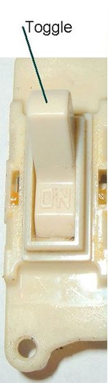
But for fun, lets say we went mad. We convinced ourselves everything on the planet should just be a toggle switch. Our empire grows, building MegaGenius designs for everything.
And we run around installing psychic modules, ripping out the offending dashboards, keyboards, steering wheels, and every affordance known to the human race, replacing them all with automated magic switches.
What happens when one of these switches breaks?
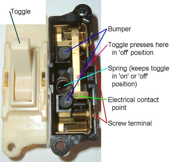
As soon as anything breaks, the repair person faces a different kind of UX, the experience of trying to repair something. Are we designing for them too? Or do we not consider them users? Is the least amount of UI appropriate for them as well? If so, inside the switch should just be another set of toggle switches, going on into infinity all the way down? Even insane designers have moments of clarity and recognize that not everyone, all the time, is best served by militant simplification. There is always a person and a scenario justifying visible, and complex UI. Not all complex UI is designed equally: there are nuances to good complex design just as there are for simple ones.
Sometimes almost NO UI is the best UI
Now lets work the other way. Imagine we ran around the universe replacing every UI for anything with airplane cockpits. In every hallway, bathroom and bedroom, you’d find this on the wall instead of a light switch. To turn your mobile phone on or off, you’d have this to deal with. Want to open a door? No knob for you, instead you have to pull twelve levers, check readings on 3 displays and then simultaneously push two butons.

Of course this is absurd.
But it’s just as absurd as replacing every cockpit with a lightswitch. While the two UIs haven’t changed, the person and situation they’re being used in has and that makes all the difference.
In the end False Dichotomies are taunts. They get people riled up and picking sides. I’m telling you not to bother. Design is about specifics and when you see people red in the face arguing about abstractions either grab a beer and watch for entertainment, or do what’s more productive for your design talents and go make something for someone.